
Sixfold — A Brand Identity Built on Connection
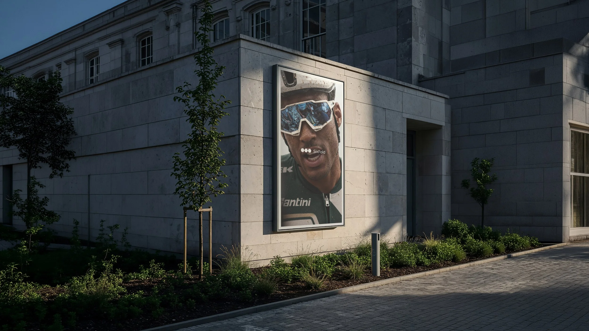
Exploring how connection shaped the thinking and identity behind Sixfold.
Finding Strength in Connection
The most interesting identities often begin with a simple idea. For Sixfold, that idea was connection. The relationship between individual elements, the strength of a collective and how separate components can become something greater when brought together.
Within sport and performance, this relationship is particularly relevant. Individual ability is important, but progress is rarely achieved in isolation. Movement, coordination and shared purpose all contribute to a larger outcome. These principles provided an interesting starting point for exploring how the Sixfold identity could look, feel and communicate. The creative challenge was to express this idea without relying on familiar conventions of sports branding. Rather than building the identity around aggression, intensity or visual excess, the direction focused on developing something more controlled and distinctive.
Early considerations centred on the relationship between form, proportion and composition. How could a simple graphic element establish recognition? How could typography and imagery communicate energy without overwhelming one another? And how could these individual decisions contribute to a recognisable identity?
The answer wasn't found in any single element, but in the relationship between them. Connection became more than the concept behind the identity. It became the principle guiding its visual development.

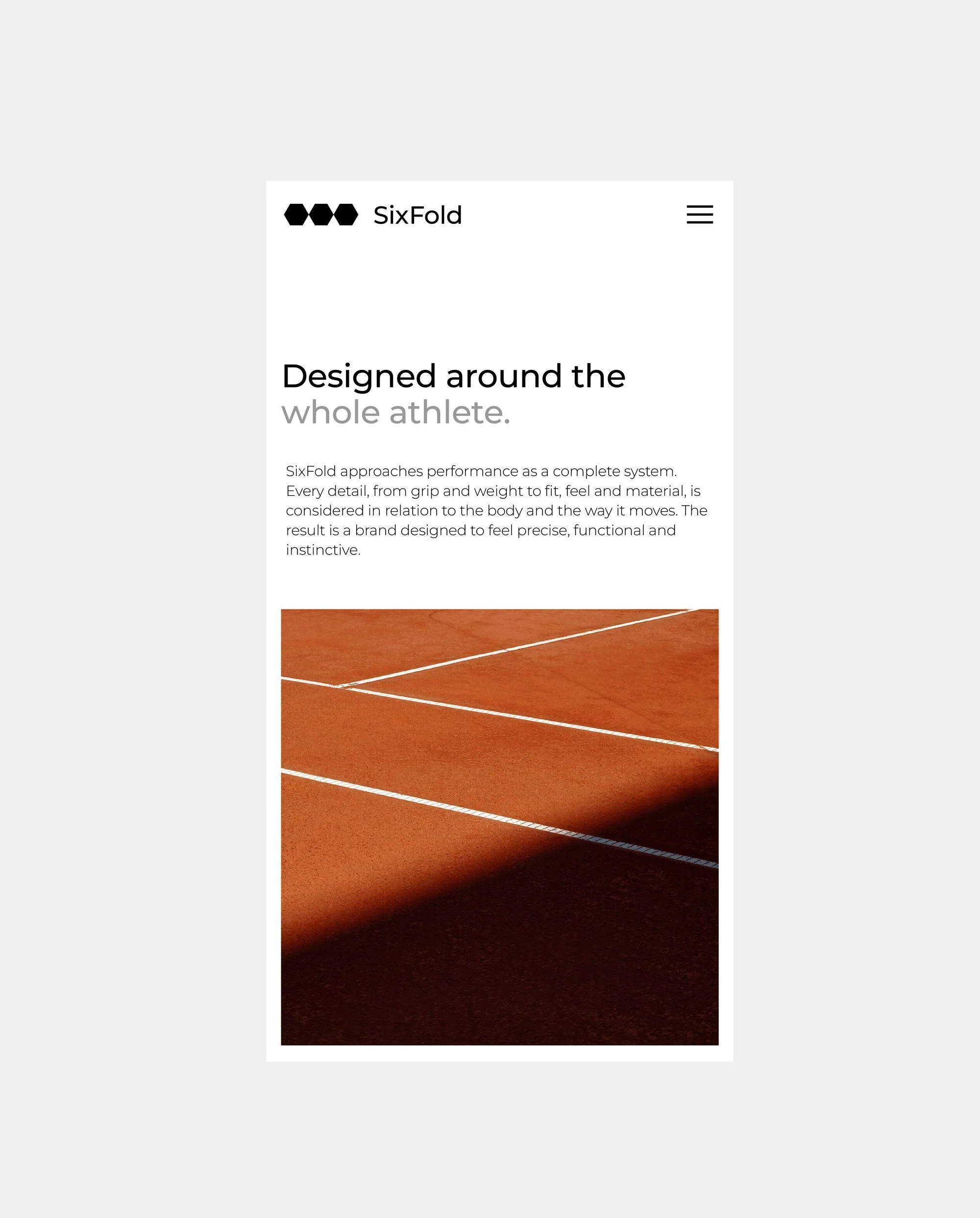
How typography, imagery and composition come together to create a distinctive and cohesive visual identity.
One Identity, Many Expressions
Translating the concept into a visual language required a balance between simplicity and expression. The identity brings together a refined wordmark, geometric forms, considered typography and a system of graphic compositions designed to work across different environments.
Athletic photography introduces movement and human character, creating contrast with the precision of the graphic elements. Typography establishes hierarchy, while carefully considered proportions and spacing provide a sense of order. The interaction between these elements allows the identity to shift between minimal compositions and more expressive applications without losing its character.
This relationship becomes particularly important when the identity moves into the real world. Large-scale advertising requires immediate recognition, while editorial layouts and digital applications allow for a more detailed expression of the visual language. Each format introduces different requirements, but the underlying identity remains connected.
What makes Sixfold interesting is how relatively simple elements can create a much broader visual experience. A symbol, a typographic treatment or a particular composition becomes more meaningful through repetition, variation and the relationships established across different applications. The result is an identity that explores a simple principle, individual elements become stronger when they work together.
