
Sixfold
A distinctive visual identity exploring connection, structure and the strength of a unified whole.
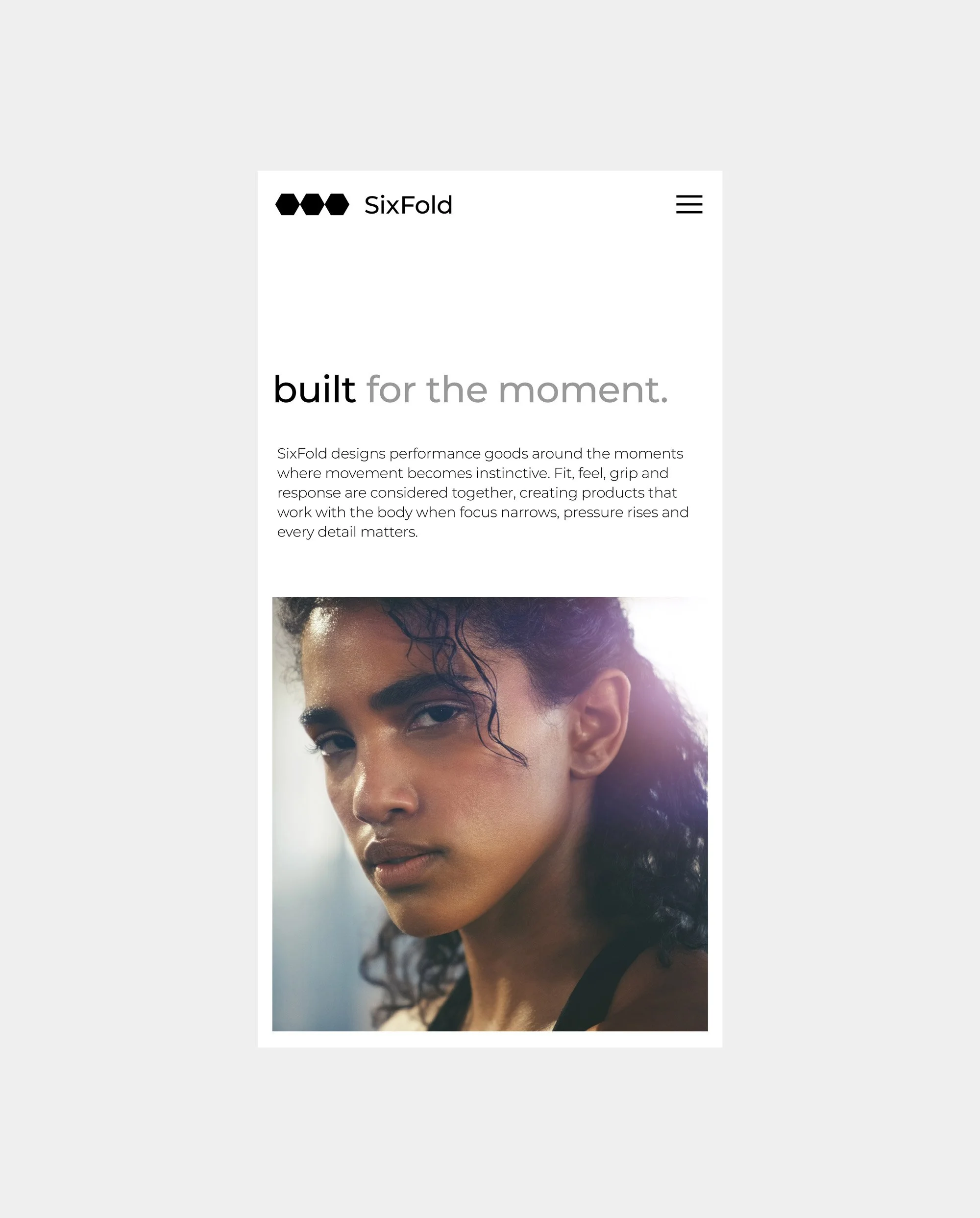
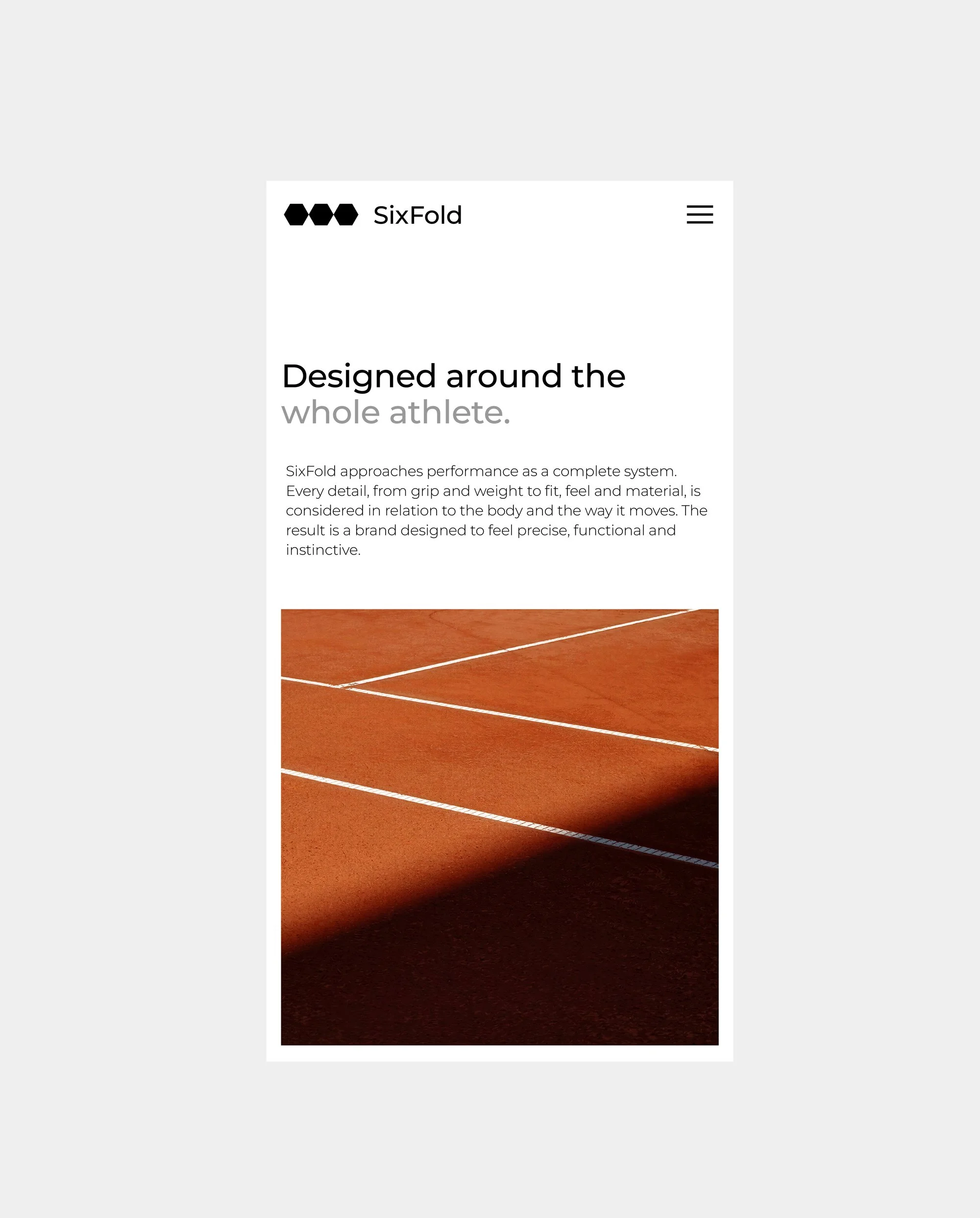
Sixfold is a brand identity project built around the relationship between individual elements and a greater collective. The identity explores how structure, consistency and considered design can create a distinctive visual language, balancing simplicity with character to establish a confident and recognisable presence.
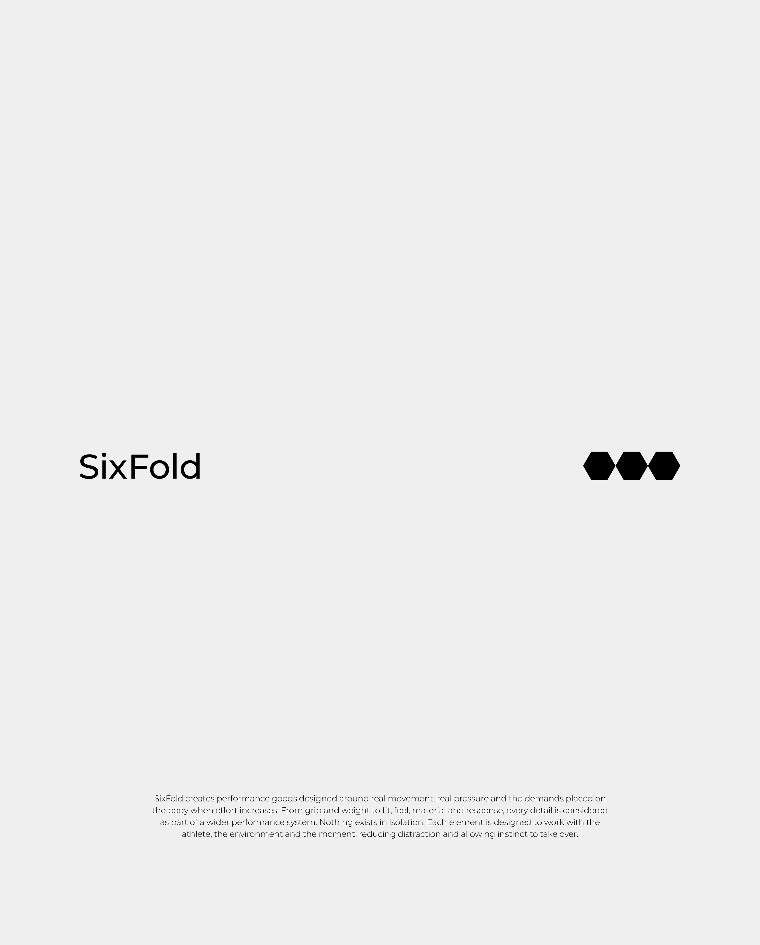
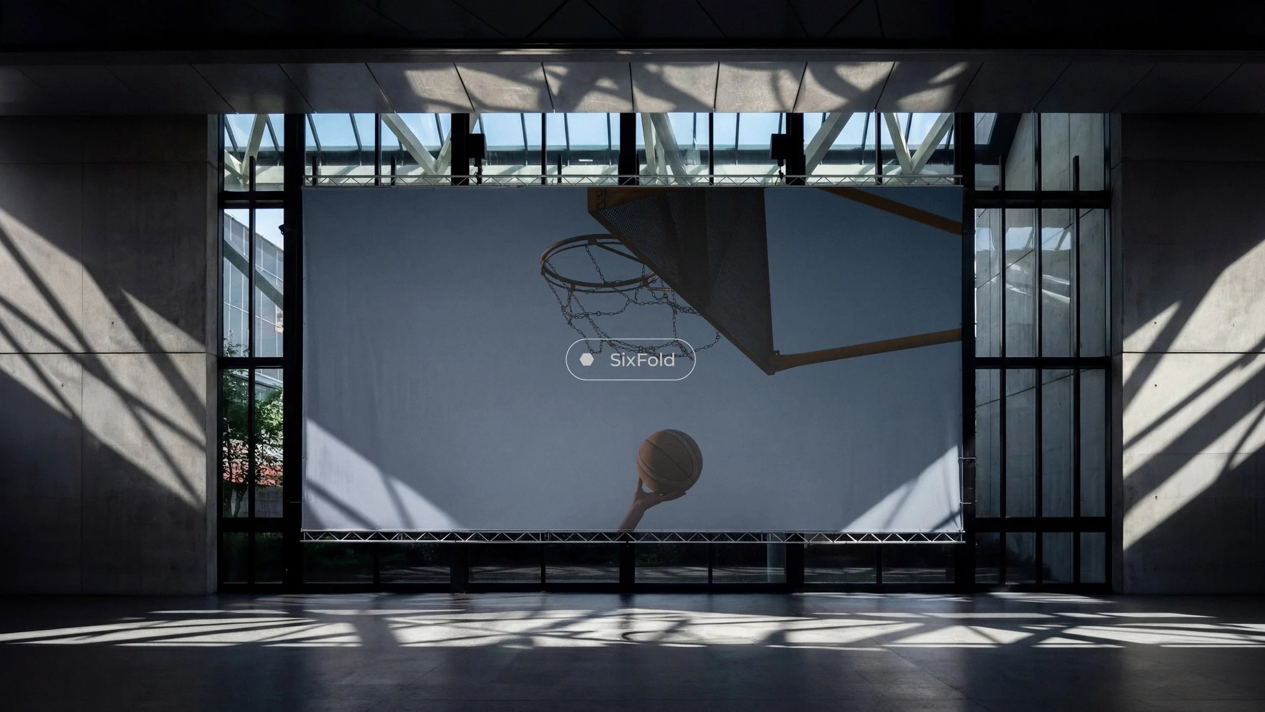
At its core is the idea that individual elements become more meaningful when brought together. This principle shaped the creative direction, informing an identity built through repetition, proportion and visual harmony. Rather than relying on unnecessary complexity, the design focuses on creating recognition through a clear and consistent visual language. Typography, composition and supporting graphic elements work together to establish a flexible system that feels contemporary, purposeful and designed to endure.
The Challenge
The challenge was to create an identity that communicated the idea of connection and unity without relying on obvious visual references. The design needed to feel distinctive without becoming complicated, structured without appearing rigid, and expressive while maintaining simplicity. Every decision was guided by the ambition to develop a recognisable identity with enough flexibility to evolve across different applications.
The Outcome
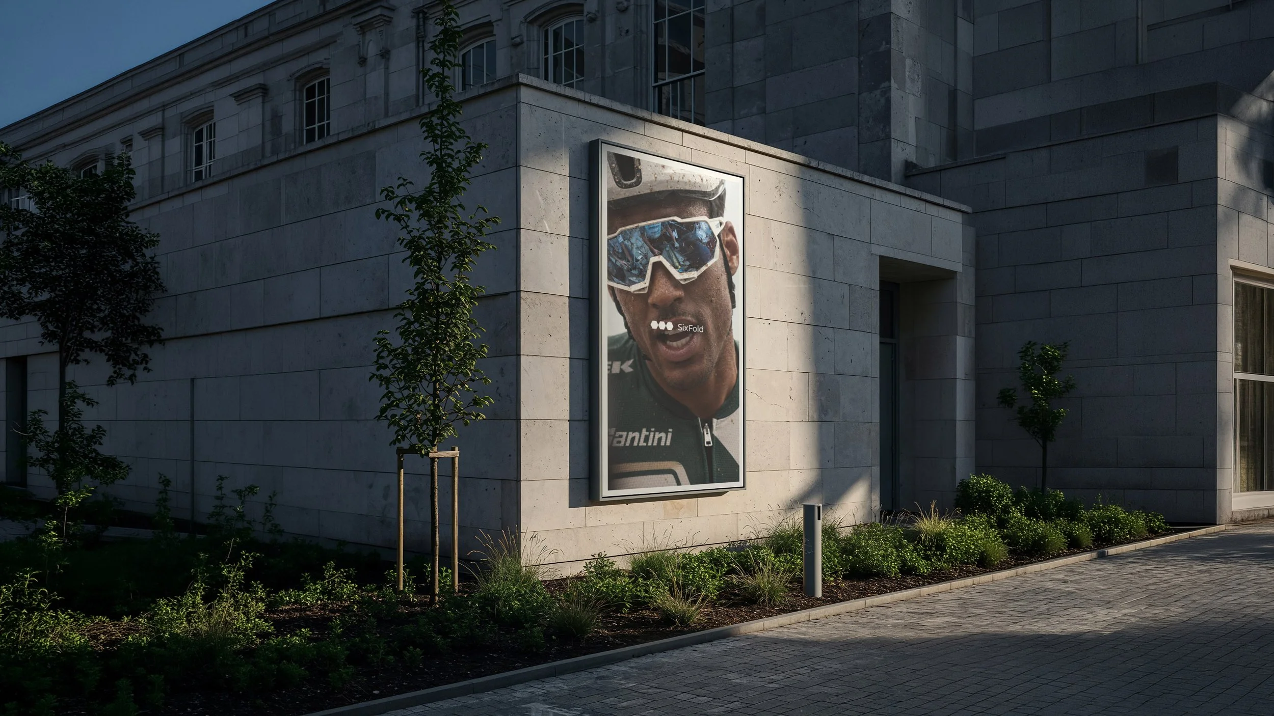
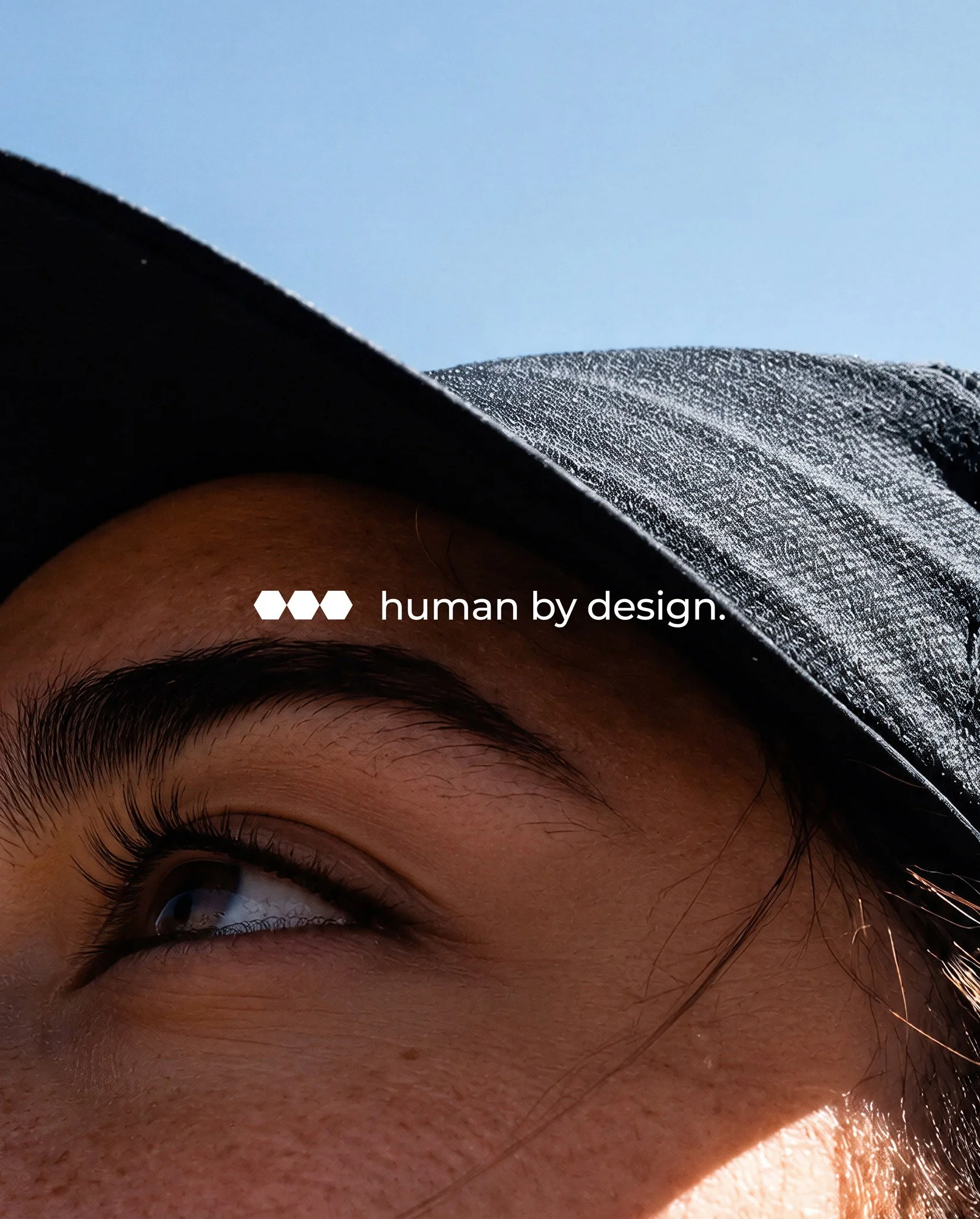
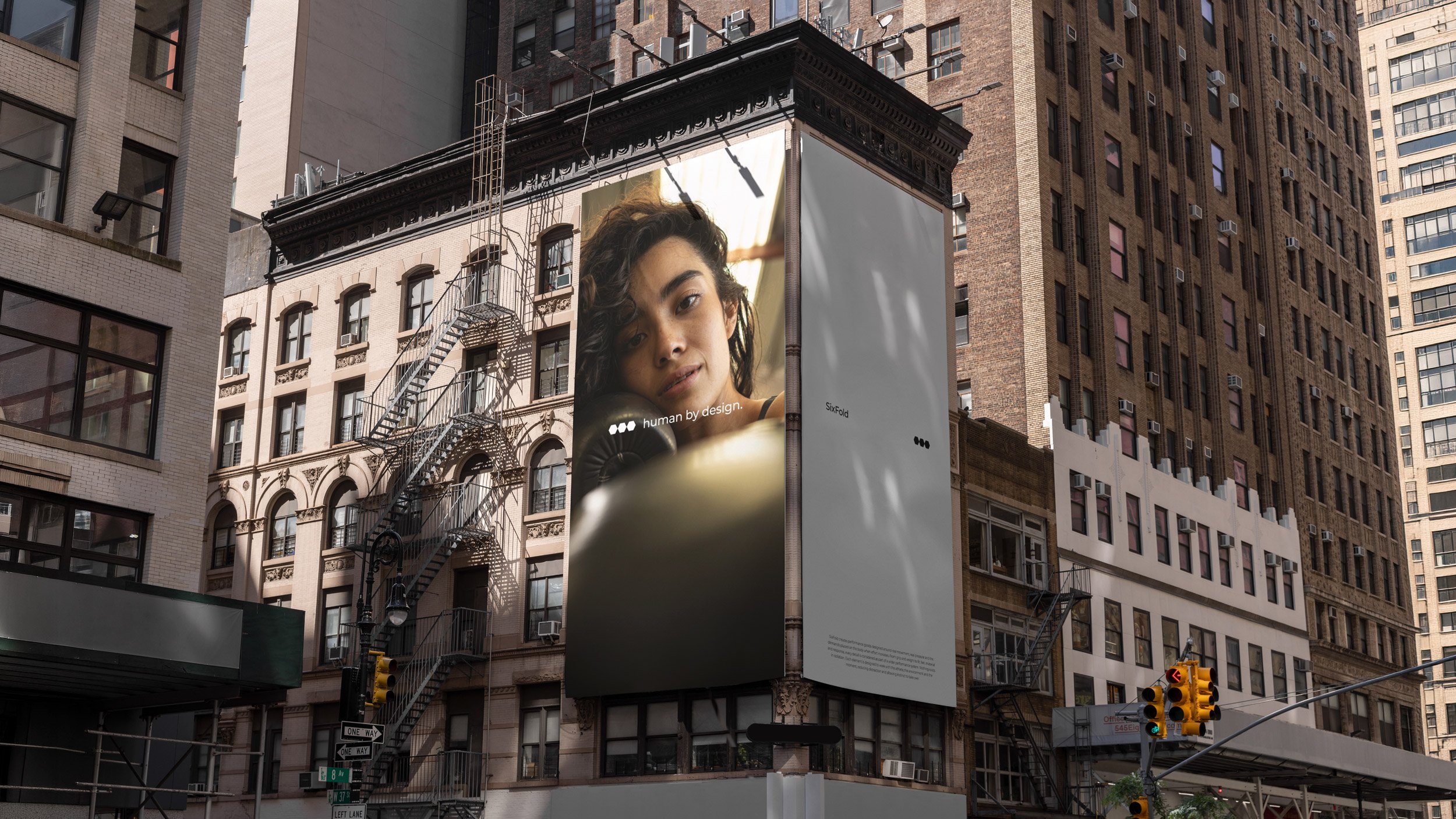
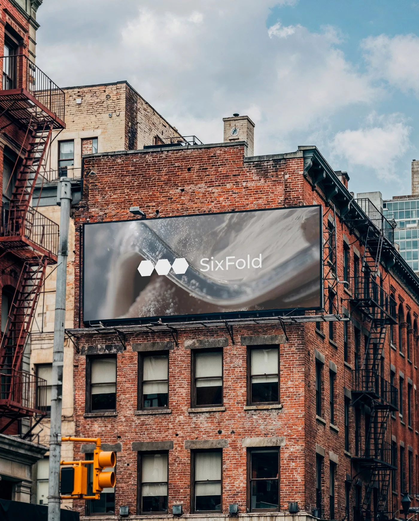
The resulting identity brings together a refined visual language, considered typography and a structured approach to composition within a cohesive brand system. Designed to adapt across digital, print and editorial applications, the identity balances consistency with creative flexibility. More than a collection of individual design elements, Sixfold represents the strength of a connected visual system.

Brand Identity Visual Systems Logo Design Typography