
What Makes a Brand Look Premium?
The Design Principles Behind High-End Brand Identities
What makes one brand feel more valuable than another? Two businesses can offer similar products, provide comparable services and operate within the same market, yet communicate entirely different levels of quality through their visual identities.
Premium branding is often associated with minimalism, elegant typography, restrained colour palettes and carefully considered imagery. While these elements can contribute to a sophisticated appearance, none of them automatically creates a premium identity. A black-and-white logo, generous whitespace or expensive photography means very little without a clear understanding of the business behind it.
The perception of quality is built through a combination of decisions. How a brand presents itself, how consistently it communicates and how carefully its identity is applied all influence the way it is understood. Understanding these principles is essential for businesses looking to establish a more distinctive, credible and valuable position within their market.
Quality Through Consideration
01. Premium Is a Perception, Not an Aesthetic
One of the most common misconceptions about premium branding is that it follows a particular visual style. Minimal typography, neutral colours and understated compositions have become closely associated with high-end businesses, but these characteristics do not automatically communicate quality. A premium identity is not defined by how little it contains, but by how deliberately its elements have been chosen. For some businesses, this means restraint and simplicity. For others, it may involve expressive typography, distinctive colours or unconventional compositions. The important distinction is intention. Every creative decision should reflect the character of the business, its audience and the value it provides. Without that foundation, even the most sophisticated identity risks becoming little more than an attractive surface.
02. Typography, Colour and Composition
Typography is one of the most influential elements of a visual identity. Before someone reads a message, the characteristics of the typeface have already begun to establish an impression. Proportions, spacing, hierarchy and weight all contribute to how a brand communicates. Colour and composition are equally important. While certain palettes are traditionally associated with luxury, no individual colour communicates quality on its own.
What matters is how colours interact, how information is organised and how consistently these principles are applied. Premium branding is rarely about adding more. It is about creating clarity through carefully considered relationships between visual elements. When typography, colour and composition work together, they establish a cohesive visual language that feels intentional rather than decorative.
03. Consistency Creates Credibility
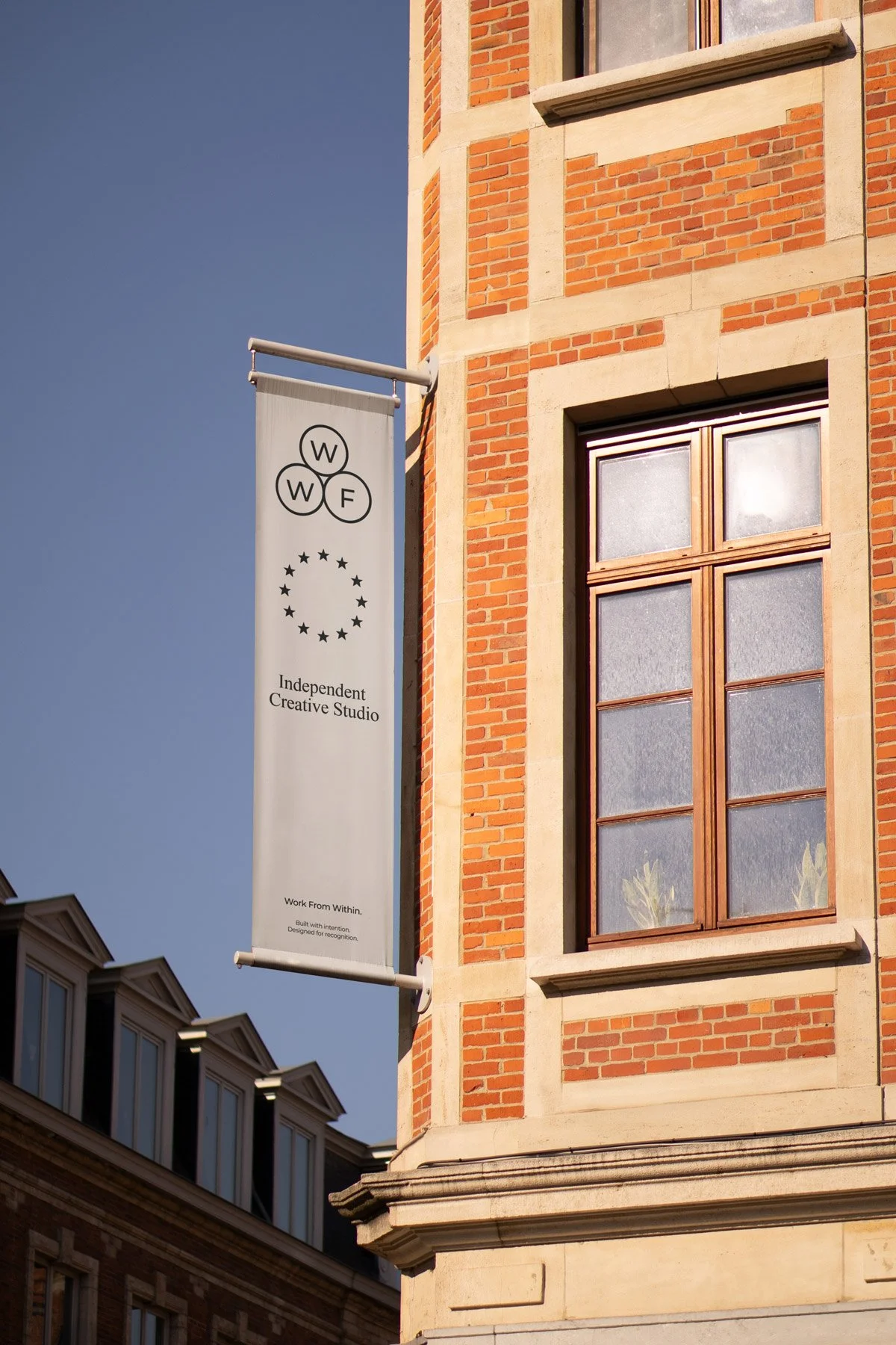
A premium identity cannot exist within a single logo, website or presentation. It must operate consistently across every environment in which a business communicates. From digital platforms and social media to packaging, printed materials and physical spaces, every interaction contributes to the overall perception of the brand. This is why successful identities are developed as visual systems rather than isolated collections of assets. A considered system establishes clear principles for typography, imagery, colour and composition while allowing enough flexibility to adapt across different applications.
Consistency does not mean everything must look identical. It means every application should feel connected, reinforcing a recognisable identity that builds familiarity, confidence and trust over time.
04. The Details Define the Difference
The distinction between an ordinary identity and a highly considered one is often found in the smallest decisions. Carefully spaced typography, consistent alignment, purposeful imagery and thoughtful material choices may seem insignificant individually, but collectively they influence how a brand is experienced. For physical applications, this might involve paper selection, printing techniques or packaging finishes. Within digital environments, it could mean refined interactions, responsive layouts and carefully controlled typography. These details should never exist purely for decoration. Their purpose is to strengthen the overall experience and communicate the standards of the business. Premium design is not necessarily more complicated or expensive. It is more considered in its execution.
05. Designing for Lasting Value
The strongest premium identities are not necessarily those that attract the most immediate attention. They are the identities that remain relevant, recognisable and appropriate as the businesses behind them evolve. Achieving this requires a balance between distinction and longevity. An identity should feel contemporary without becoming dependent on temporary trends, and distinctive without sacrificing clarity.
Ultimately, a premium visual identity must reflect the genuine quality of the business it represents. Sophisticated design can establish expectations, but those expectations must be supported by the products, services and experiences being delivered. Effective branding does not manufacture value. It identifies, articulates and communicates what makes a business worth choosing.
