
Introducing the New Workflow Studio Rebrand
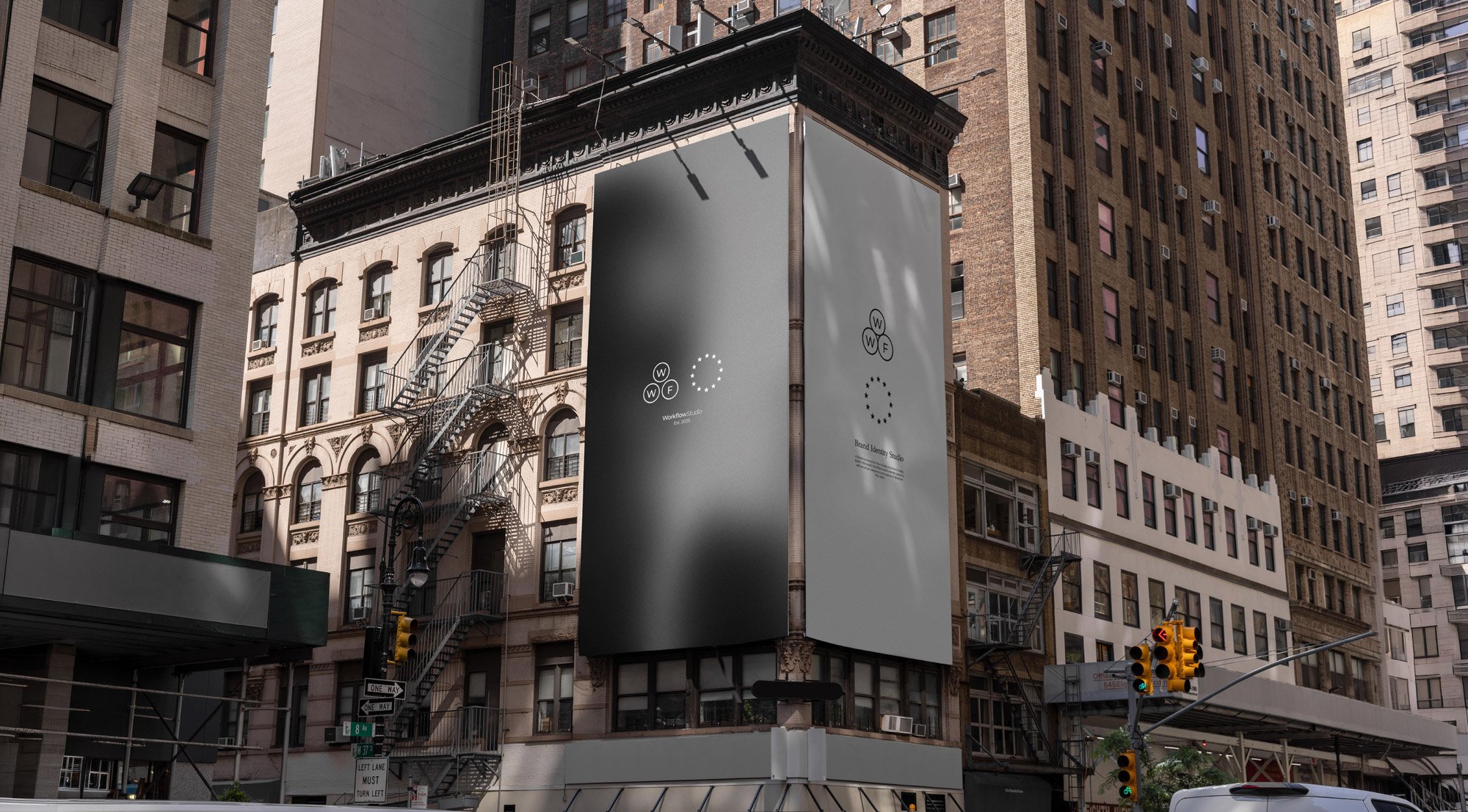
A new identity, a clearer direction, and the thinking behind Work From Within.
A Studio in Progress
Designing for yourself presents a different kind of challenge. When you're so close to the work, finding the distance to question, explore and refine your own ideas becomes increasingly difficult. For Workflow Studio, the decision to rebrand wasn't simply about creating something new. It was an opportunity to reflect on what the studio represents, how it approaches design and the direction it wants to pursue.
As Workflow has evolved, so has my understanding of the creative process and the kind of work I want to produce. Each project brings new perspectives, challenges and opportunities to explore different approaches. Research, experimentation and thoughtful decision-making have become fundamental to the studio's practice, shaping not only the finished work but the process behind it.
The previous identity had served its purpose, but the studio had developed beyond its original direction. It needed a visual language that better communicated its values, creative ambitions and growing body of work. Something distinctive without being excessive, structured without becoming restrictive and confident without relying on passing trends.
Rather than approaching the rebrand as a complete reinvention, the process became an exercise in refinement. Understanding what was essential, questioning what could be removed and developing a visual identity that could evolve without losing its character.
The result is a clearer creative direction, a more cohesive identity and a philosophy that brings everything together, Work From Within.
Workflow was never meant to be static.
Work From Within
At the centre of the rebrand is the belief that meaningful design begins with understanding what makes a business distinct. Its purpose, personality and ambitions should inform the creative direction, allowing an identity to emerge from a deeper understanding rather than being shaped around a predetermined aesthetic.
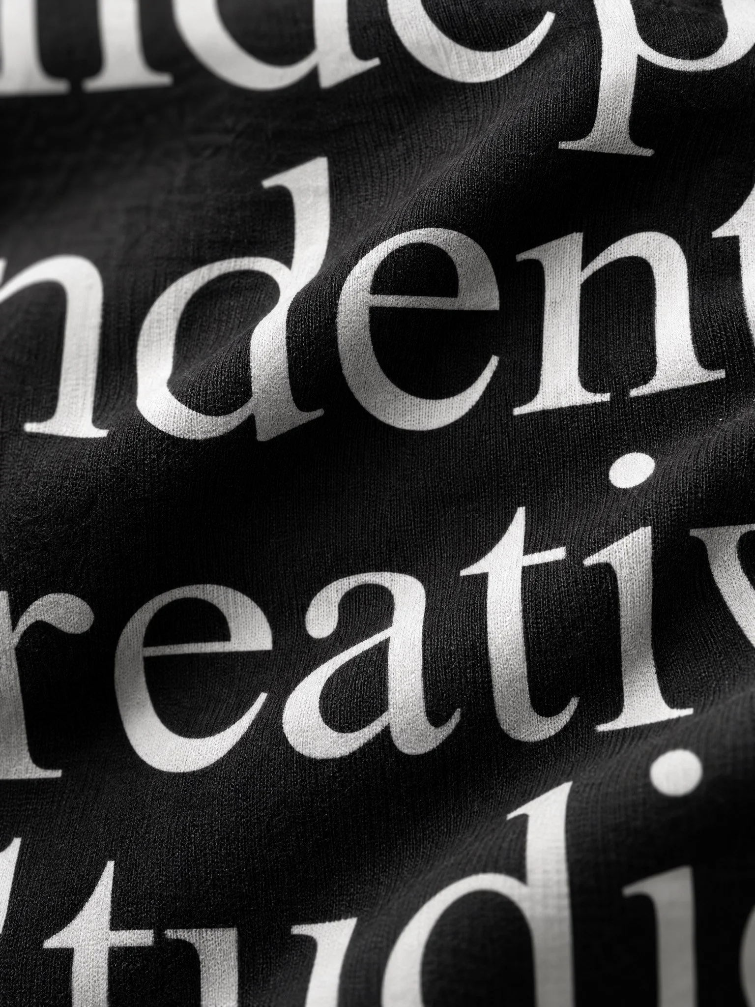
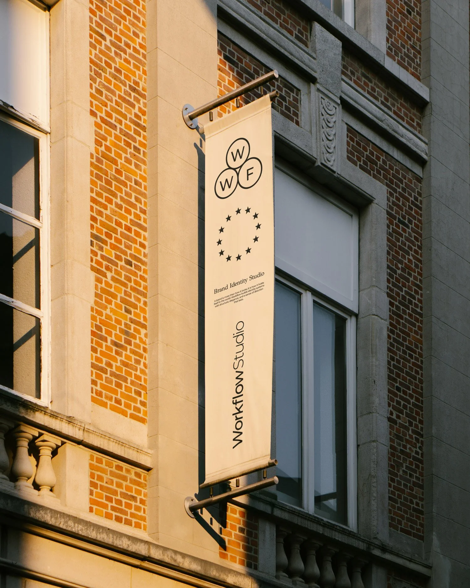
That thinking became the foundation of Workflow's new visual language. A structured WFW symbol, refined typography and a restrained colour palette establish a recognisable identity, while precise compositions, considered layouts and atmospheric imagery create a balance between structure and expression. Each element has been developed to work independently while contributing to a larger, connected visual system.
The intention was never to create a collection of individual graphics, but to establish an identity that could adapt across different environments. From digital platforms and editorial layouts to printed materials and physical applications, the system is designed to remain consistent without limiting creative exploration. Structure provides the foundation, while flexibility allows the identity to continue developing.
Alongside the rebrand comes a redesigned website, a more thoughtful presentation of our projects and a dedicated space for Insights. An opportunity to share creative perspectives, explore the decisions behind the work and document the continuing development of the studio. Beyond presenting finished projects, the intention is to offer a greater understanding of the research, experimentation and ideas that shape them.
As an independent creative studio, Workflow remains grounded in direct collaboration, curiosity and a commitment to creating identities with purpose. The new identity represents an evolution rather than a finished destination. A stronger foundation for new projects, different challenges and the creative opportunities that lie ahead.
It's a process, not a logo.
