Pure Strength
Pure Strength was created as more than a gym identity, it was built as a movement. A space centred on small-group and one-to-one training, focused on helping people show up consistently and improve over time, both physically and mentally.
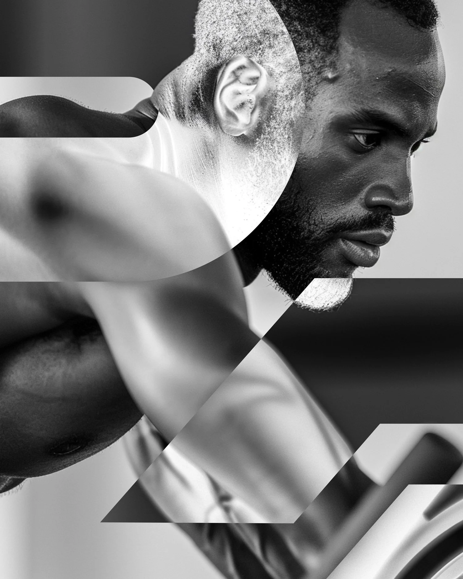
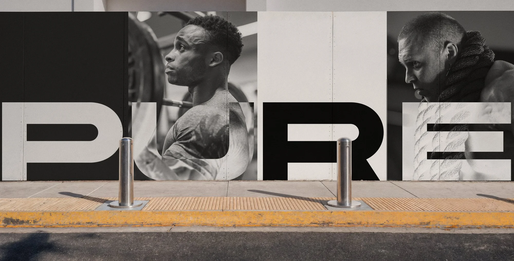
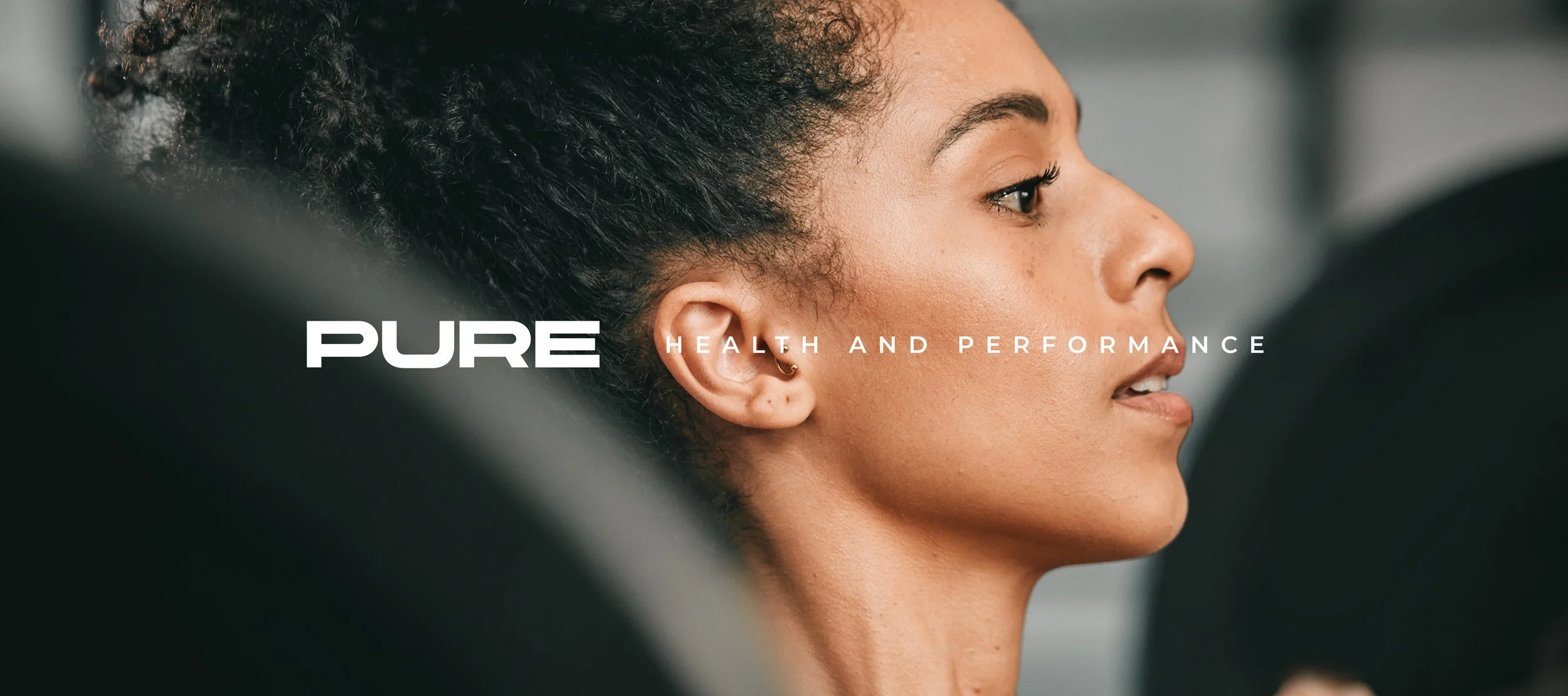
The identity was developed through repetition, control, and discipline. Reduced to its core, the mark reflects movement, balance, and intent without decoration or excess. Nothing is added for effect, every decision is deliberate. The result is an identity that doesn’t rely on volume or bravado, it communicates strength through restraint.
Built as a complete system, Pure Strength was designed to perform under pressure. From motion and layout to application and imagery, each element works together with precision and clarity. The system is flexible yet controlled, allowing the brand to move confidently across environments while remaining instantly recognisable.
Identity System Logo Design Branding