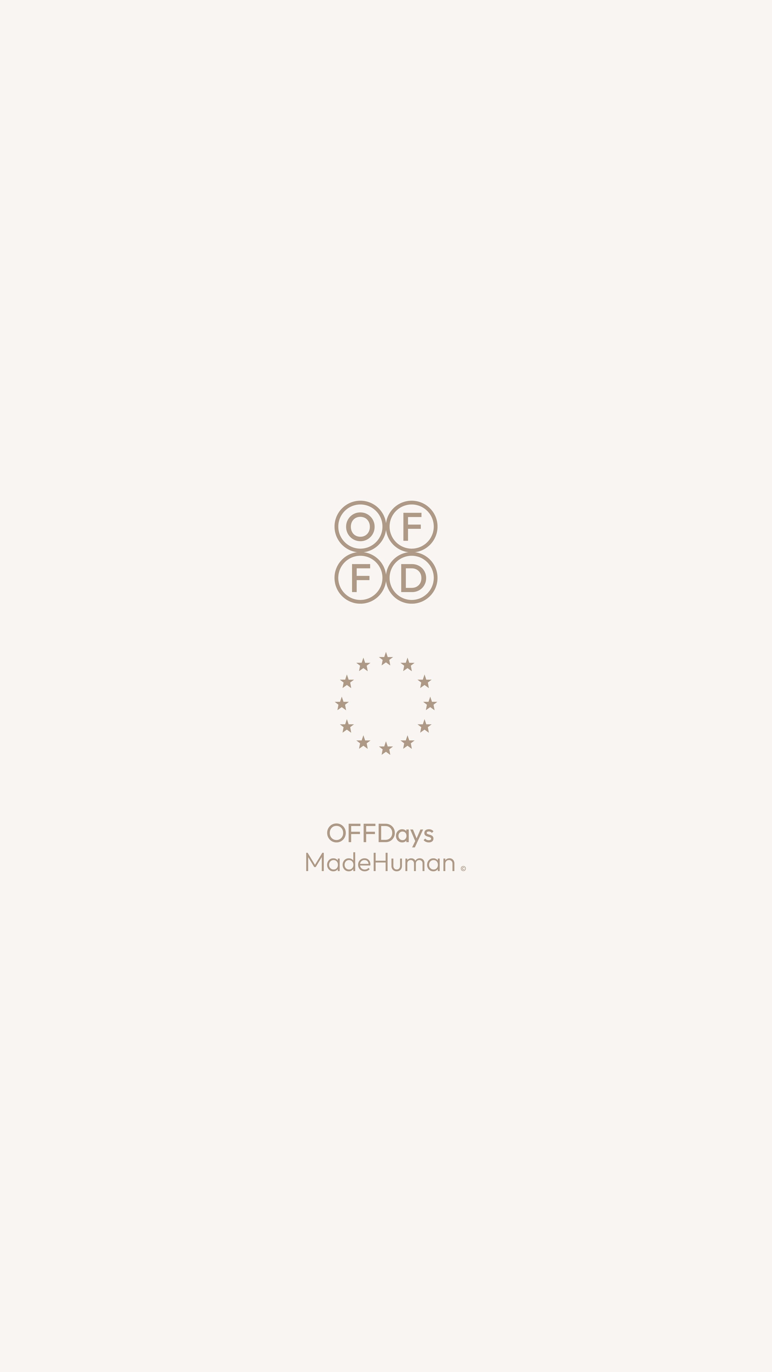
OFFDays
OFFDays™ is a lifestyle brand rooted in the space between who you are and who you’re trying to be. For the days you feel off. For the versions of yourself that arrive without warning. For happiness remembered more than held. It stands for acceptance, a quiet reminder that not every day needs to shine to still matter.
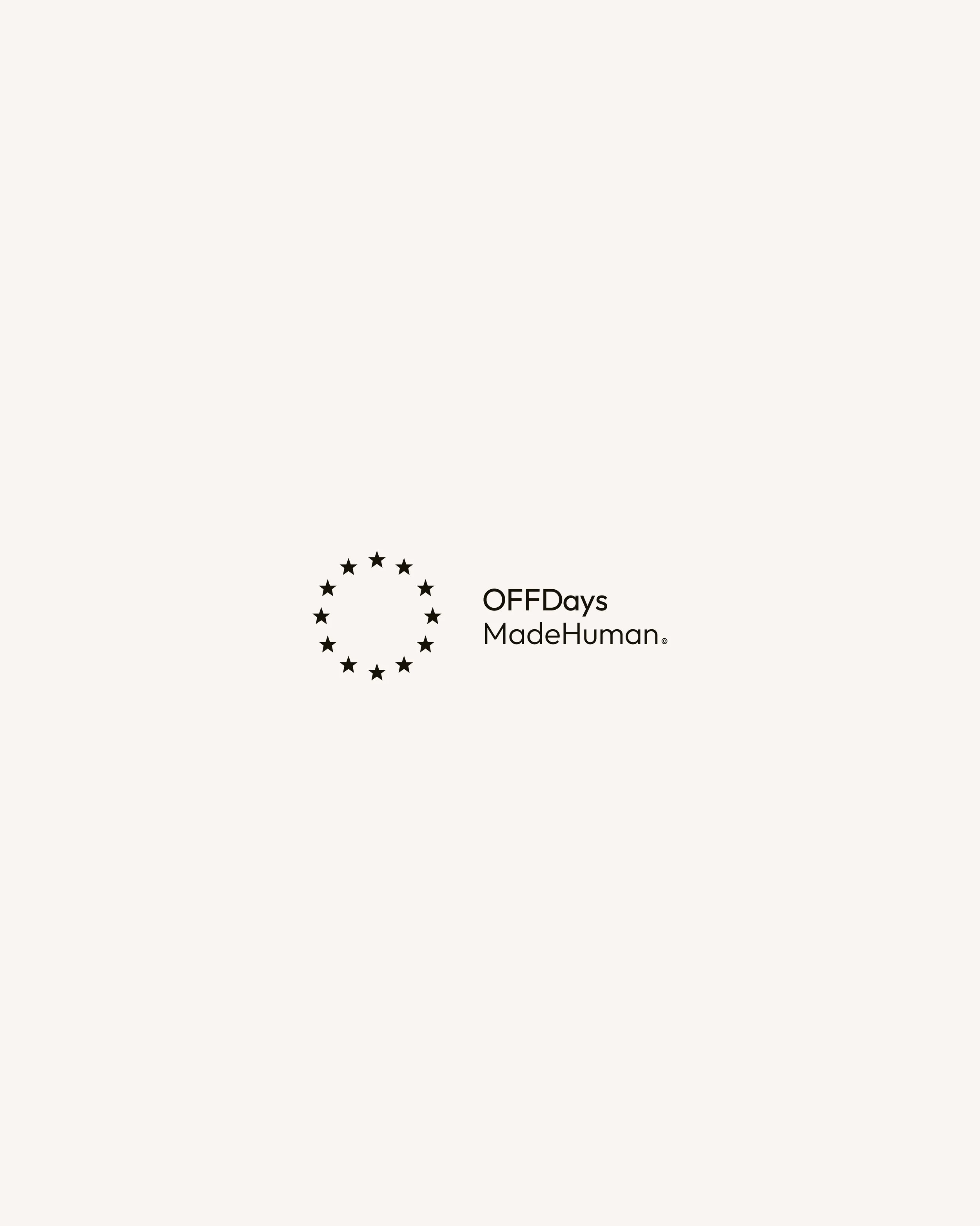
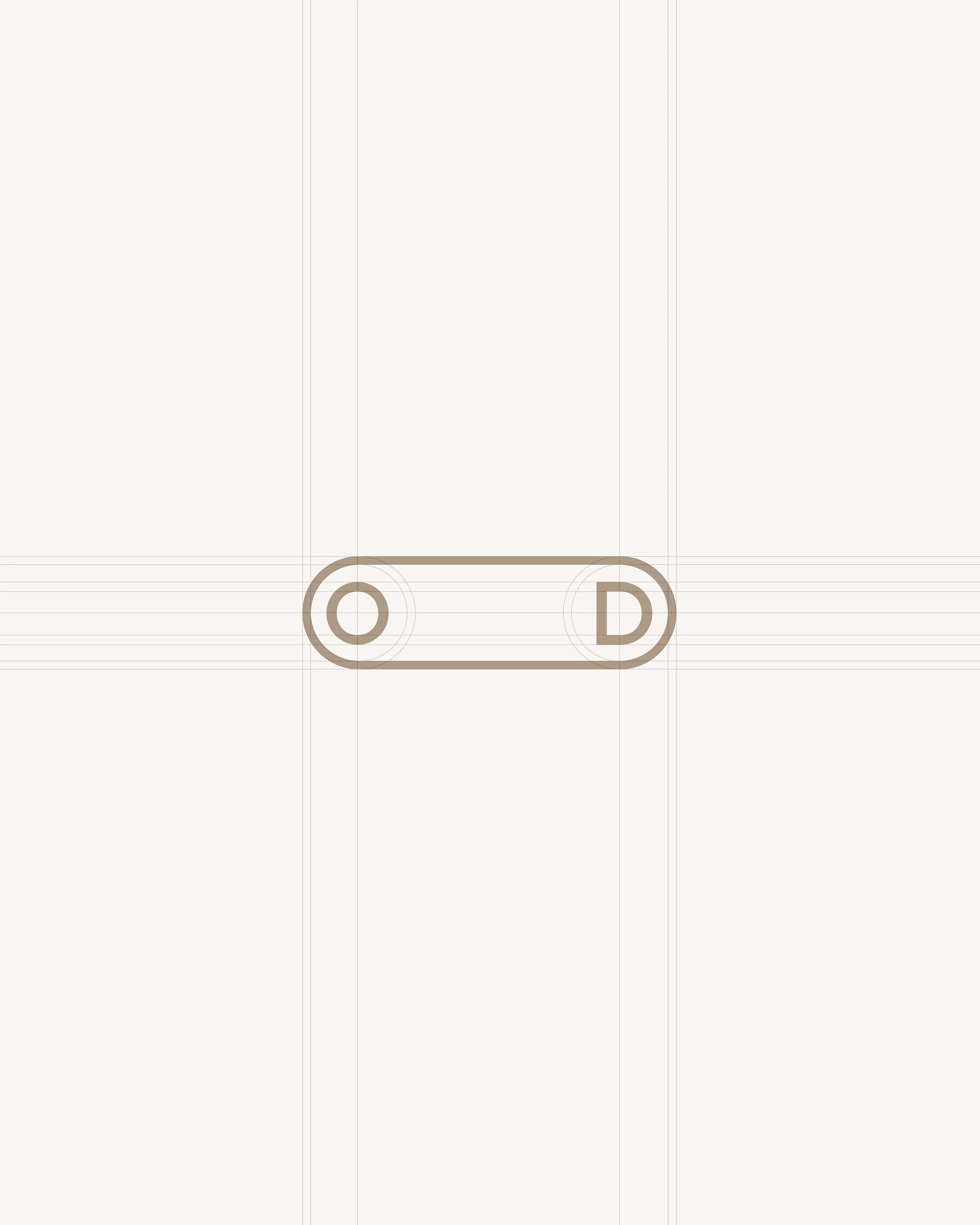
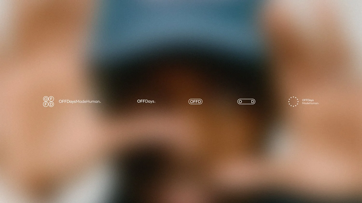
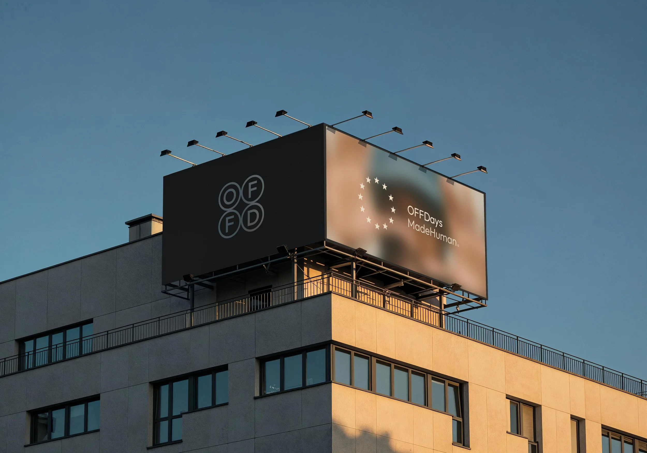
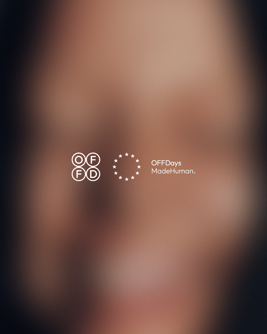
The visual identity was designed to feel minimal, structured, and timeless, using typography-led hierarchy, generous spacing, and controlled composition to create a system that communicates calm confidence. Rather than relying on noise, the identity uses reduction and repetition to build recognition. a refined wordmark, a suite of secondary marks, and modular symbol variations designed for flexible use across touchpoints.
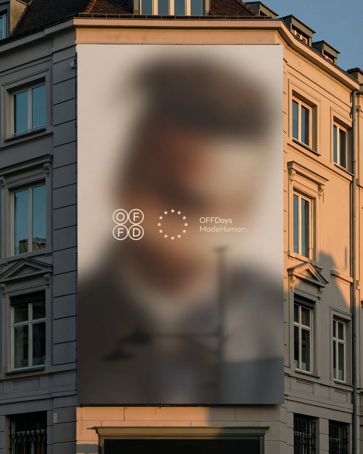
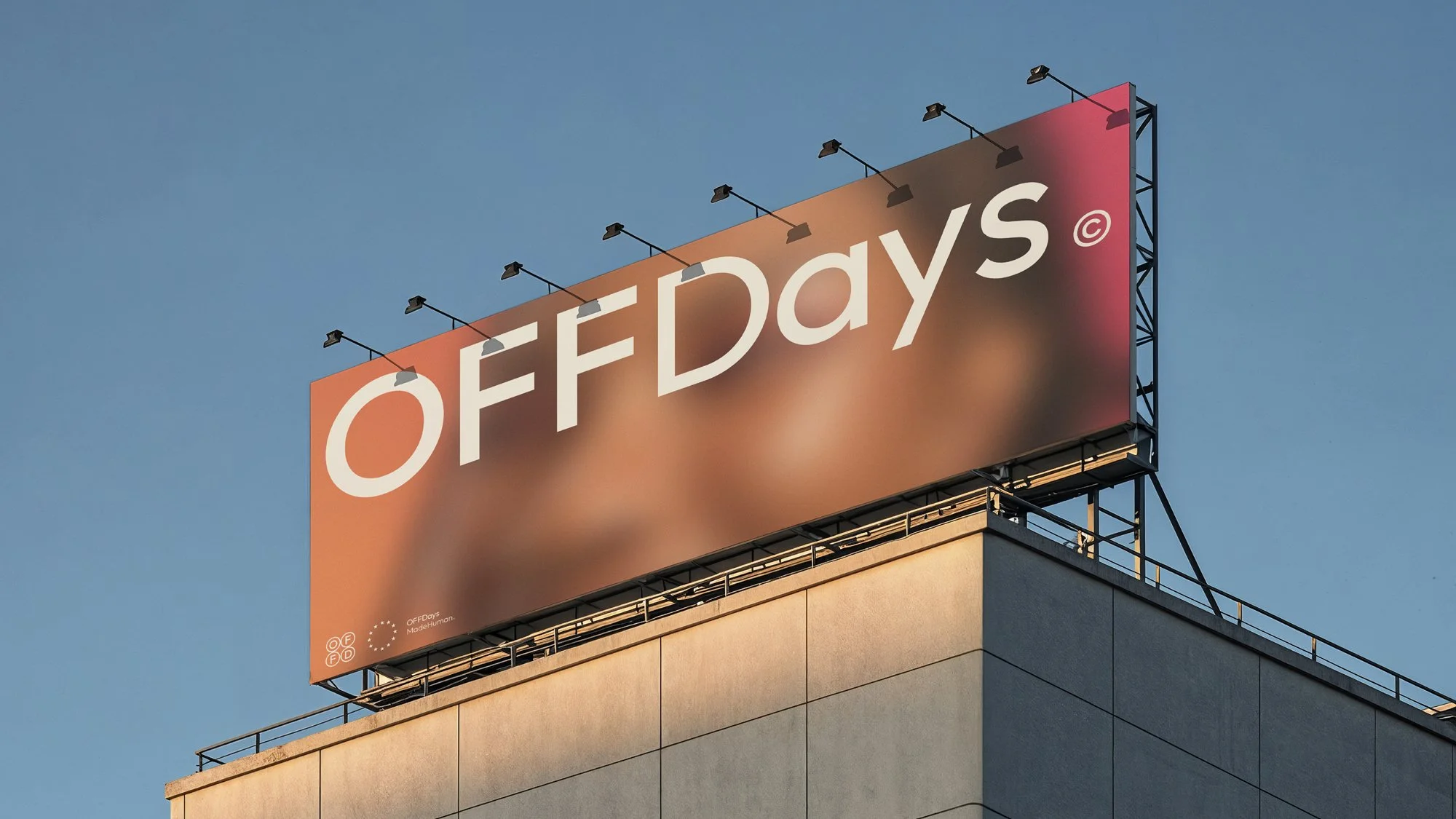
The blurred imagery used represents happiness as a fading memory rather than proof. By obscuring detail, the system steps away from spectacle and instead focuses on mood, distance, and emotional residue. This approach creates an editorial visual language that feels restrained, reflective, and intentionally human.
Logo Design Identity Branding