Acro
Acro is a renewable energy brand built around a simple but ambitious idea, reimagining the relationship between people and the planet. Rather than positioning sustainability as a technical challenge alone, Acro approaches energy as a system shaped by intention, care, and long-term responsibility.
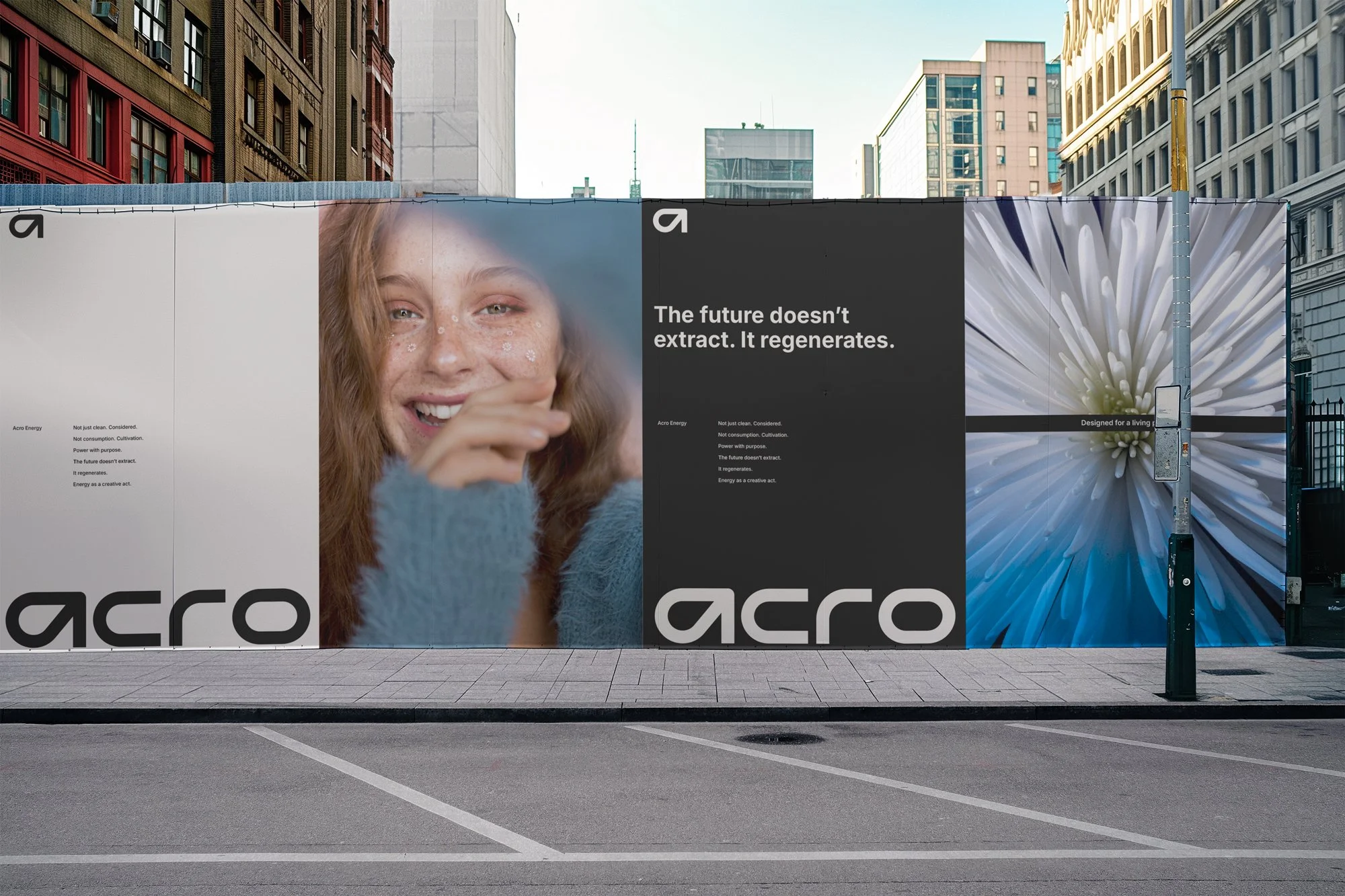
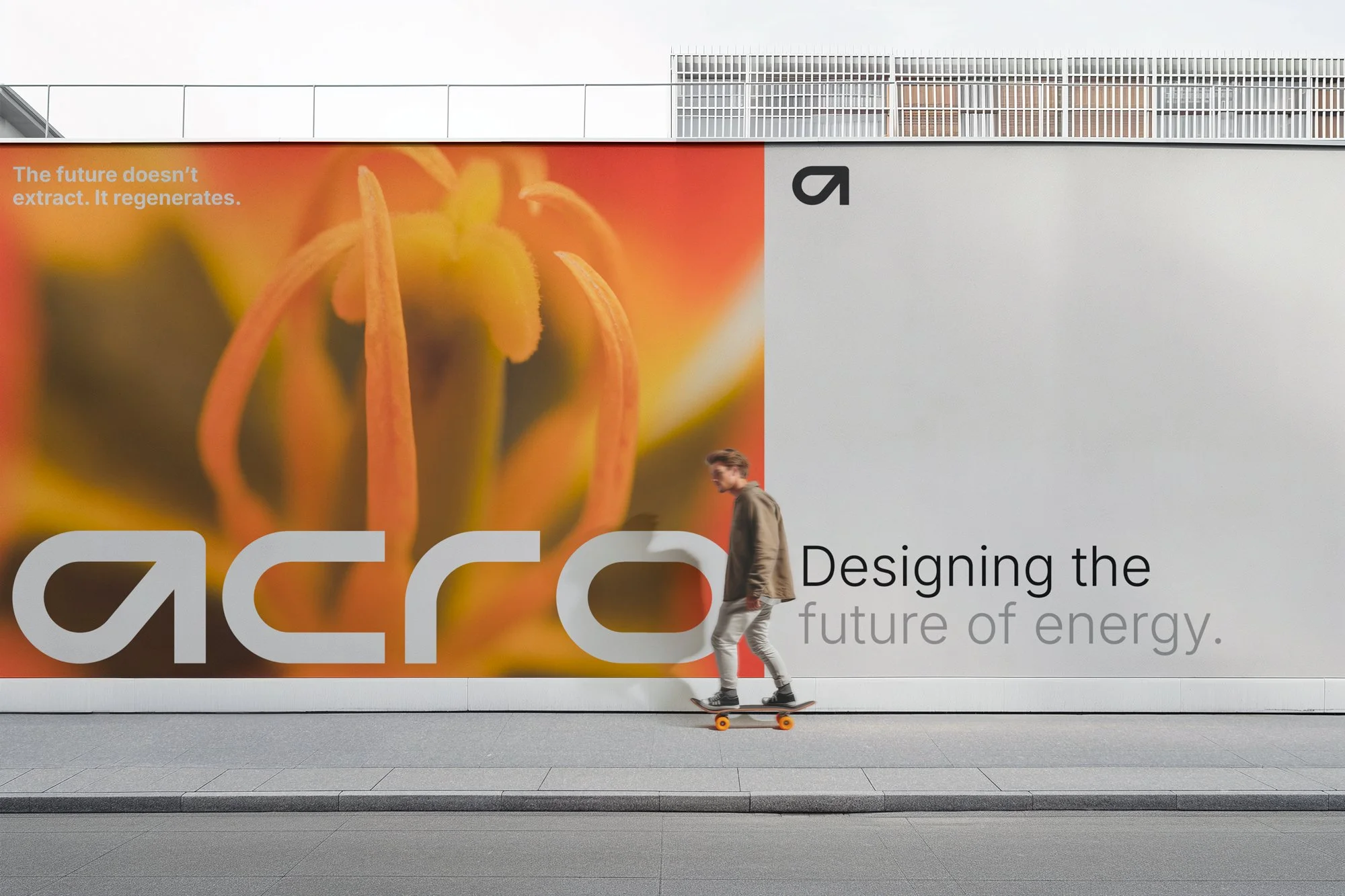
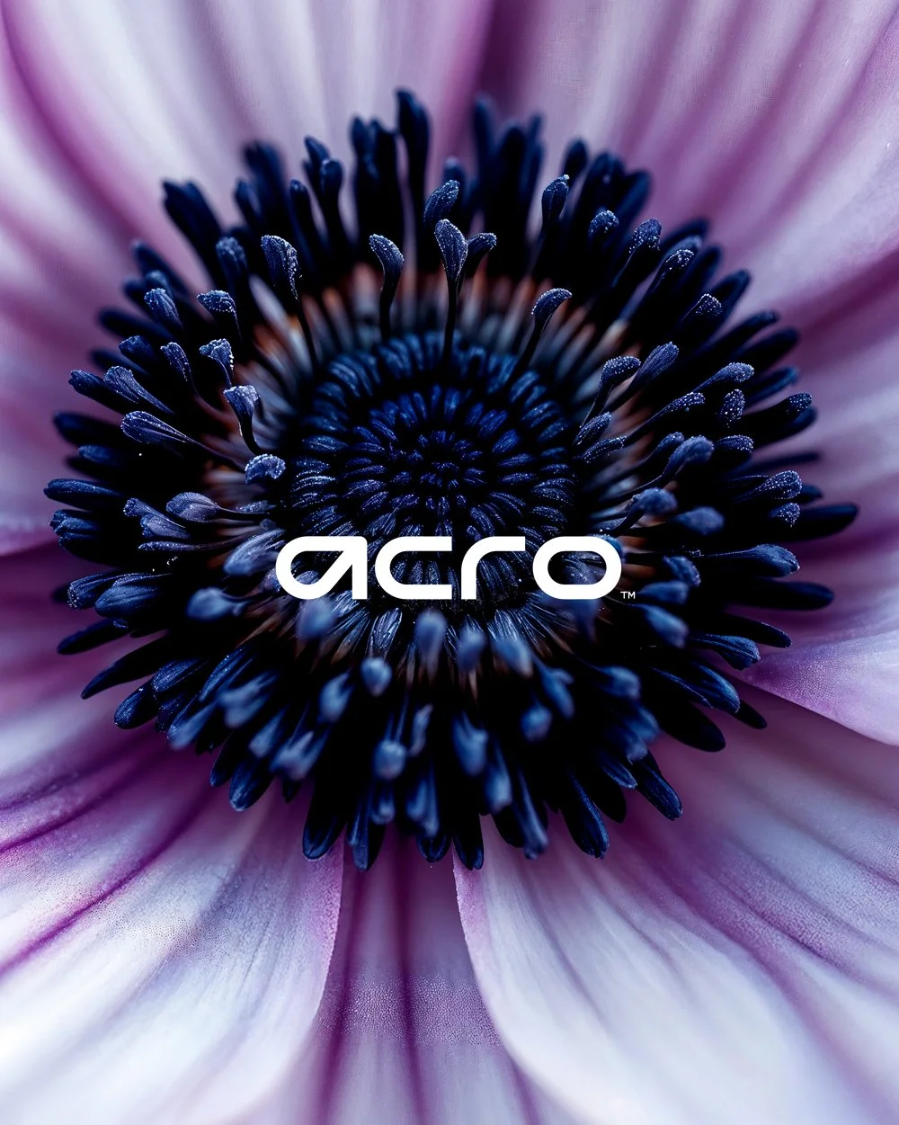
The identity was developed to reflect this philosophy. Inspired by natural forms and living systems, the visual language balances clarity with warmth, combining a confident, contemporary wordmark with expressive imagery that feels human and alive. Every element is designed to communicate regeneration over extraction, connection over consumption.
Built as a cohesive system, the brand scales seamlessly across infrastructure, digital platforms, and large-format environments. From typography and layout to imagery and motion, each touchpoint works together to reinforce a clear worldview: energy should empower, sustain, and support life in all its forms.
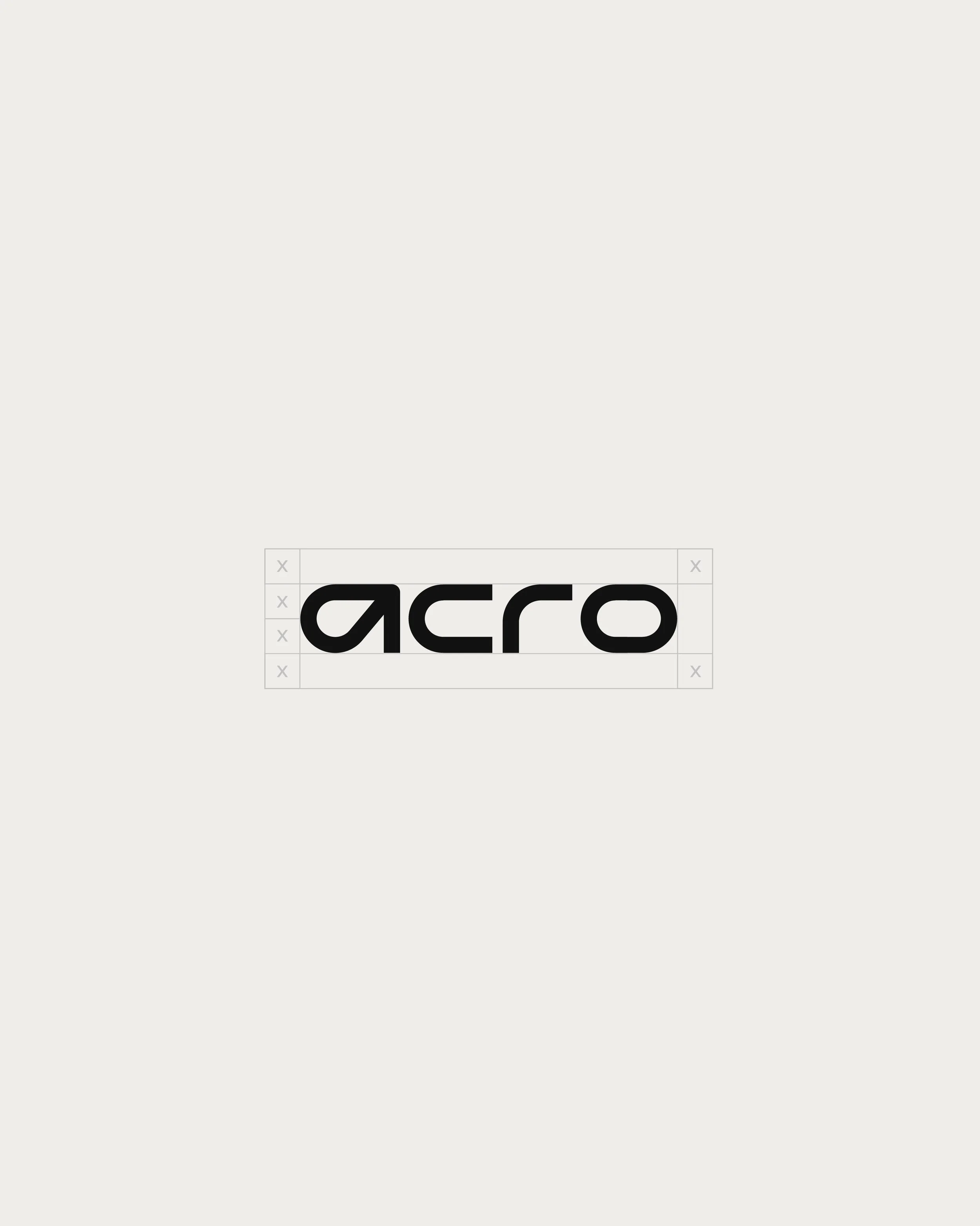
Identity System Logo Design Branding